Interactive 3D for land and events
Interactive 3D Maps for Land Projects, and Why They Raise Support
How an interactive 3D map helps a land project, eco village or new build show people what is coming, what goes on one, and how to keep it fast on a phone.
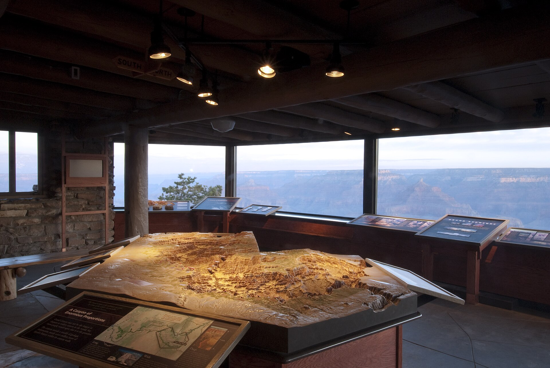
A land project lives or dies on whether people can picture it. Investors, neighbours, future residents, county planners and donors all have to imagine a field becoming a village, a festival ground or a build site, and most of them are imagining it from a PDF.
An interactive 3D map closes that gap. Instead of a site plan with a legend, people get the actual land: the slope, the pond, where the road comes in, which parcel is theirs. They can spin it, zoom in, switch layers on and off, and tap a point to read what is planned there.
I build these for land projects, construction, festivals and fundraising, and there is a working example on the Green Fire tech page. Here is what makes them useful, and what makes them fail.
What a 3D map does that a site plan cannot
A flat plan asks people to translate. Contour lines into hills, rectangles into buildings, a blue shape into water. Some people do that easily. Most do not, and the ones who cannot are often exactly the people you need: a donor, a neighbour worried about the view, a family deciding whether to move.
A 3D map does the translation for them. In practice that shows up in three ways:
- Fewer of the same questions. Where is the parking, how far is it from the creek, what is that building. When people can look for themselves, the questions you get are better ones.
- Honest scale. Distances and slopes read correctly. Nobody is surprised later that the gathering space sits below the road.
- A reason to come back. A map that updates as the project moves is something people share and revisit, which a PDF never is.
What goes on one
The best maps are built from layers that people can switch on and off, so the view never gets cluttered. A typical land project map has:
- The terrain itself, shaped from real elevation data, so the land looks like the land
- Parcels or zones, coloured by use or by status, sold, reserved, available
- Water, ponds, creeks and drainage, which matter more than almost anything else on rural land
- Planned structures, simple massing at first, more detail as designs firm up
- Points of interest, small labels pinned to places, that open a short description when tapped
Each layer answers a different audience. Planners care about drainage and access. Residents care about their parcel and the view. Donors care about the shared spaces their money builds. One map, with layers, serves all of them without three separate documents.
Keep it fast, or nobody sees it
Most people will open your map on a phone, often on a slow connection, often from a link in a text message. If it takes ten seconds to load, they close it.
This is where a lot of 3D work goes wrong. Popular 3D libraries are powerful and heavy, and a site that ships one to every visitor gets slower everywhere, including pages with no 3D at all.
The scenes on the tech page are written directly against the browser's own graphics layer, with no 3D library. The whole interactive section downloads as a single 12.9 kB compressed file, and only for visitors who actually open that page. The rest of the site carries none of it. That is a measured number from the build, not a target, and it is the reason the map opens quickly on an ordinary phone.
You do not need that level of hand building for every project. But you should ask anyone making your map one question: how big is it, and what does it cost the rest of the site?
Using it to raise money
For fundraising, the map does something a pitch deck cannot. It lets a donor stand in the place their gift creates.
The pattern that works is simple. Show the land as it is today. Then switch on the layer for the thing you are raising for, the community kitchen, the water system, the first homes, and let people see it appear in place. Pin the cost and the timeline to it. A donor who has seen the kitchen on the hill understands the ask far better than one who has read about it.
The same map works in person. Put it on a screen at an open day or a fundraising dinner, and let people explore it while you talk.
When a 3D map is not worth it
If your project is still choosing between very different sites, wait. A map of the wrong land is wasted work. The same goes for a project with no real elevation or survey data yet; a guessed terrain looks convincing and can mislead.
The right moment is when you have the land, a rough plan, and people you need to bring along. That is usually earlier than people think, because the map helps the plan get better.
Getting one made
If you are planning a land project, an eco village, a festival site or a new build and want people to see it before it exists, take a look at the interactive 3D work and get in touch from there. If your project is a community one, the open source side of Green Fire may also be useful, and there is more on running projects like this on the blog.
 AI for musicians and artists · October 26, 2026
 AI for small business · October 21, 2026